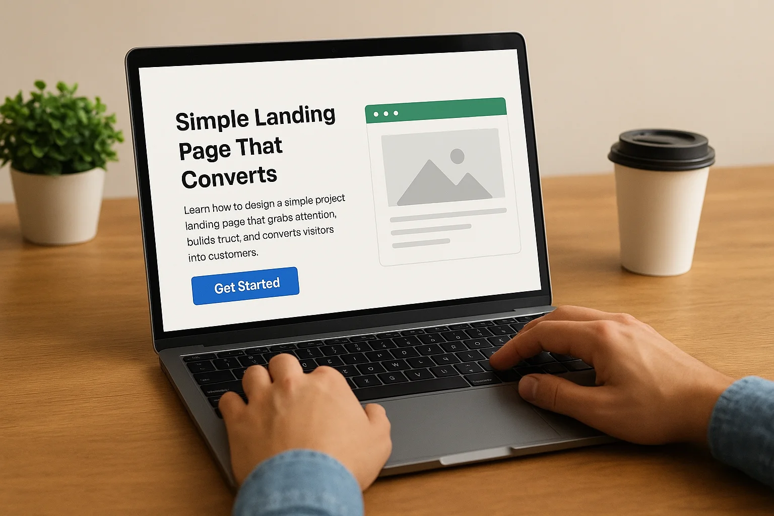
How to Create a Simple Project Landing Page That Converts
Define Your Goal Before You Design
Before you start thinking about layouts, colors, or visuals, the very first step in building a landing page is to define its main objective. A landing page without a clear purpose often confuses visitors and fails to generate results. Ask yourself what single action you want your audience to take. Should they subscribe to your newsletter, download a resource, sign up for early access, or make a purchase?
Once you know your goal, everything on the page should be designed to drive users toward it. This means your headline, body copy, visuals, and especially your call to action must all align with that specific objective. Having a focused goal also prevents you from overwhelming visitors with too many choices, which can lead to decision fatigue and lower conversion rates.
A practical way to stay aligned is to write down your goal in a single sentence, such as: “This landing page exists to collect emails from people interested in my product launch.” Keep this sentence visible as you design. It will serve as a filter to evaluate whether each element on the page supports or distracts from your main objective.
Another key point is to consider who your audience is. A goal is only effective if it resonates with the people you are targeting. For example, if you’re addressing first-time visitors, your objective might be to educate and build trust. For returning users, the focus could shift toward encouraging a purchase or an upgrade. By aligning your goal with the stage of the customer journey, you significantly increase the chances of conversion.
Finally, remember that a well-defined goal not only simplifies your design process but also makes it easier to measure success. If your landing page is created with a single, clear purpose, you’ll be able to track performance metrics directly tied to that outcome, giving you actionable insights for future improvements.
Craft a Compelling Headline
Your headline is the very first element visitors will notice, and in many cases, it determines whether they will stay on the page or leave immediately. A strong headline should grab attention instantly and clearly communicate what the user can expect. It acts as a promise: if visitors continue reading, they should know what value they will gain.
To make your headline effective, focus on clarity over creativity. While clever wording can work, what truly matters is that your message is immediately understandable. For example, instead of writing a vague headline like “The Future of Productivity”, a clearer version could be “Save 10 Hours a Week With Our Task Automation Tool”. The second option tells users exactly what benefit they’ll get.
Another proven technique is to highlight a key benefit or outcome. Visitors often ask themselves: “What’s in it for me?” If your headline answers this question directly, you build instant relevance. Phrases that promise a solution to a common pain point, highlight time savings, or offer measurable results are particularly effective.
It can also help to use power words—terms that trigger emotion or urgency. Words like “proven,” “instant,” “exclusive,” “effortless,” or “guaranteed” create a sense of value and credibility. However, these should be used sparingly and backed by real substance to avoid sounding like empty marketing jargon.
Keep in mind that your headline doesn’t have to do all the work alone. You can use a subheadline right beneath it to add more context. The headline captures attention, and the subheadline provides supporting details or expands on the promise without overwhelming the reader.
Finally, always consider the perspective of your target audience. A headline that resonates with startup founders may not appeal to students, and vice versa. The language, tone, and benefit highlighted should align with the group you want to reach. Testing different headline variations is an excellent way to identify what message connects best with your audience.
Use Clear and Concise Copy
The text on your landing page plays a critical role in guiding visitors toward the action you want them to take. Unlike blog articles or detailed guides, landing page copy should be short, direct, and benefit-driven. Every word must serve a purpose: if it doesn’t clarify, convince, or motivate, it risks distracting or confusing your audience.
One of the most effective principles is to write with the reader in mind. Instead of focusing on product features, highlight the benefits users will experience. For example, rather than saying “Our software has a built-in automation system”, you could write “Save hours every week by letting our software automate repetitive tasks for you.” The second version speaks directly to the user’s needs and makes the value crystal clear.
Keep your sentences short and easy to scan. Online readers rarely consume content word by word—they skim. Use simple language, avoid jargon, and structure your text so the most important points stand out quickly. Lists, short paragraphs, and bolded key phrases make your copy easier to digest.
Another useful technique is to incorporate action-oriented language. Words like “discover,” “get,” “start,” “unlock,” or “achieve” encourage readers to imagine themselves already benefiting from what you offer. This type of phrasing not only conveys energy but also naturally leads into your call to action.
Clarity also means being specific and measurable. Vague claims such as “improve your workflow” are less persuasive than precise outcomes like “reduce project turnaround time by 30%.” Specificity builds credibility and helps potential customers trust that your product or service can truly deliver results.
Lastly, ensure consistency in your tone. Whether you choose to be professional, friendly, or authoritative, the copy should feel cohesive across headlines, body text, and call-to-action buttons. A mismatched tone can create confusion and weaken trust, while a unified voice reinforces your brand identity and strengthens the overall message.
Leverage Visuals That Support Your Message
Visual elements are powerful tools for strengthening your landing page because they can communicate complex ideas quickly and capture attention in a way that text alone cannot. A well-chosen image or graphic should not just decorate the page—it should support and clarify your message, making it easier for visitors to understand the value you offer.
Start by selecting visuals that directly connect to your product or service. For example, if you are promoting a software tool, showing screenshots of the interface gives visitors a clear idea of what they will be using. If your goal is to build trust, photos of real team members or customers can add authenticity. Avoid generic stock images that feel disconnected, as they can weaken credibility and reduce engagement.
Another effective approach is to use illustrations or icons to break down information into digestible parts. A simple diagram that demonstrates how your solution works, or icons that highlight core benefits, makes your page easier to scan and more visually appealing. These elements guide the eye naturally, helping users focus on the most important information.
Video is also a highly persuasive format. A short, well-produced video can demonstrate your product in action, showcase customer testimonials, or tell the story behind your project. Since many people prefer watching over reading, video can significantly increase engagement and help explain concepts faster.
Keep in mind that visuals should not overwhelm the message. Use them strategically to reinforce key points rather than distract. For instance, placing an image next to a call to action can draw attention to it, while using white space around visuals prevents the page from feeling cluttered. Balance is essential: the goal is to create a smooth flow between text and images.
Finally, ensure all visuals are optimized for performance. Large, uncompressed images or auto-playing videos can slow down your page, which frustrates users and harms conversion rates. Always use web-friendly formats and test loading speed to maintain a seamless experience across devices, especially on mobile.
Build Trust with Social Proof
Visitors arriving on your landing page are often skeptical. They want reassurance that your product or service actually delivers on its promises. This is where social proof becomes essential. By showing evidence that others have already benefited from your offer, you create a sense of credibility and reduce the perceived risk of taking action.
One of the most powerful forms of social proof is the testimonial. Short quotes from real customers describing their experience can strongly influence new visitors. To make testimonials effective, include the person’s full name, photo, and if possible, their role or company. This makes the feedback feel genuine and verifiable. A vague statement like “Great product!” carries far less weight than a specific one such as “This tool helped our team cut reporting time in half.”
Another way to build credibility is by displaying logos of trusted clients, partners, or media outlets. If recognizable brands use or recommend your product, this association instantly transfers trust to your own brand. Even if your audience doesn’t know your company yet, they are likely to respect names they already recognize.
Case studies can also be extremely effective. Unlike short testimonials, they provide a deeper look into how your solution helped a customer solve a real problem. A structured case study might highlight the initial challenge, explain the approach taken, and showcase measurable results. This not only proves your product works but also helps potential customers imagine how it could apply to their situation.
Don’t overlook numbers and statistics. Displaying how many users have signed up, how many downloads your app has, or how much money your customers have saved creates a sense of scale and trustworthiness. People often feel more comfortable joining something that is already widely accepted or validated by others.
Another subtle but effective method is to incorporate social media proof. Screenshots of positive comments, user-generated content, or influencer endorsements show that people are actively engaging with your brand outside of your website. This type of validation feels authentic and up-to-date, especially for younger audiences who value peer recommendations.
To maximize the impact of social proof, place it strategically near key decision points. For example, positioning testimonials just before your call to action can reassure hesitant users and push them to commit. Similarly, displaying client logos near the top of the page can make a strong first impression.
Ultimately, social proof works because people trust the experiences of others more than promises from a brand. The more authentic and verifiable your proof is, the more it will strengthen confidence and help turn visitors into customers.
Simplify Your Call to Action (CTA)
Your call to action is the element that directly drives conversions, making it one of the most critical parts of your landing page. A CTA should be clear, simple, and impossible to miss. Visitors must understand immediately what will happen when they click the button or follow the link. If there is any doubt or confusion, the chances of conversion drop significantly.
The first rule is to focus on one main action. Offering multiple CTAs with different goals, such as “Sign Up,” “Download,” and “Contact Us,” can overwhelm visitors and dilute the effectiveness of your page. Instead, guide users toward a single, specific step that aligns with the goal you defined earlier. This eliminates distractions and makes the path forward obvious.
Pay close attention to the language of your CTA. Instead of using generic phrases like “Submit” or “Click Here”, choose action-oriented text that communicates value. Examples include “Start Your Free Trial,” “Get Instant Access,” or “Join 5,000+ Happy Users.” This type of wording not only tells users what to do but also highlights the benefit of doing it.
Placement also plays a major role. Your CTA should be visible without scrolling, typically near the top of the page, but it can also be repeated in other key areas, such as after testimonials or feature descriptions. Repetition ensures that no matter where visitors are in their journey through your content, the option to take action is always within reach.
Design choices around your CTA matter as well. While the overall page design should remain clean and minimal, the CTA itself should stand out visually. Use contrasting colors, larger text, or surrounding white space to make it clear that this is the most important element on the page. The goal is not to overwhelm the user with design tricks, but to subtly draw their eye to the next step.
Another important aspect is to remove friction. If clicking your CTA leads to a complicated form with too many fields, many visitors will abandon the process. Instead, ask only for essential information, such as an email address or name, and reduce unnecessary steps. The smoother the action, the higher the conversion rate.
Finally, consider adding a secondary reassurance near your CTA. Phrases like “No credit card required,” “Cancel anytime,” or “Takes less than 2 minutes” reduce hesitation and make users feel more comfortable committing. This combination of clarity, simplicity, and reassurance helps transform a hesitant visitor into a confident participant.
Ready to showcase your project?
Join thousands of developers and entrepreneurs who have already listed their websites in our directory. Get discovered by potential users and grow your audience.
Free to list • Instant approval • No hidden fees
Related articles

How to Bounce Back After a Slow Launch
Discover practical strategies to recover from a slow product launch. Learn how to analyze setbacks, refine messaging, reignite interest, build customer trust, and optimize for sustainable growth.

5 Free Platforms to Promote Your Project Online Without a Budget
Discover five free platforms to boost your project online, reach your audience, and grow your visibility—no budget required. Learn how to promote effectively!
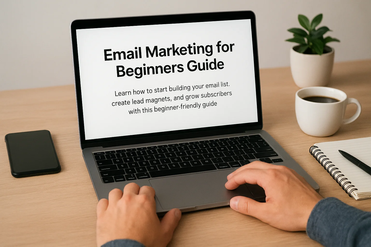
Email Marketing for Beginners: How to Start Building a List
Email marketing remains one of the most effective tools to grow your audience and boost sales. In this beginner’s guide, you’ll learn how to start building your email list from scratch, create compelling lead magnets, set up signup forms, and engage subscribers with effective strategies to grow your business sustainably.
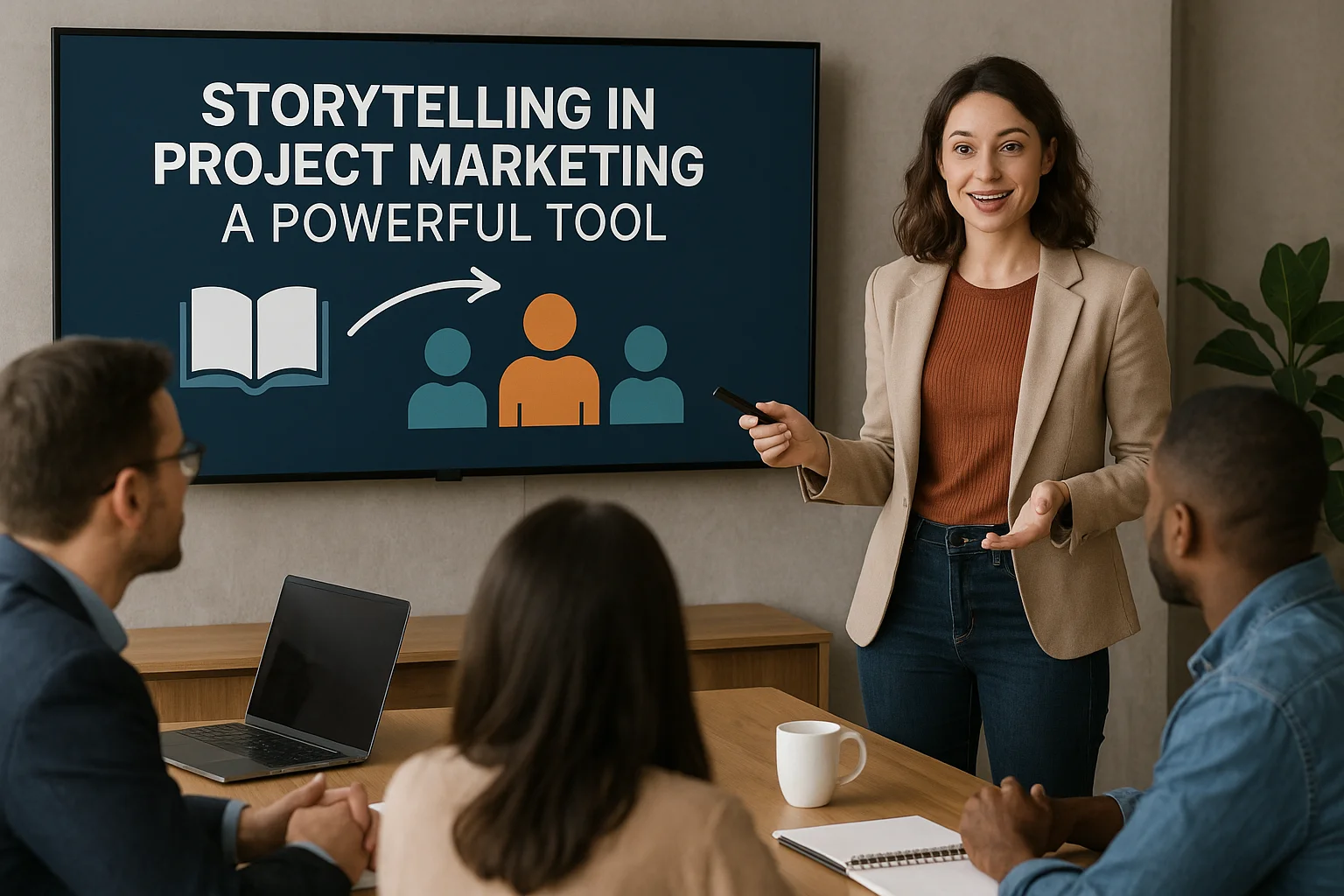
The Power of Storytelling in Project Marketing
Storytelling is more than just a buzzword—it’s a strategic way to bring projects to life. By weaving narratives that connect emotionally, project marketing becomes more engaging, memorable, and persuasive. This article explores the psychology of stories, how to craft compelling narratives, and the impact of storytelling across different channels to elevate project success.

Influencer Marketing for Small Projects: Where to Start
Influencer marketing isn't just for big brands. Even small projects can benefit by partnering with the right influencers. This guide will show you how to set goals, find the perfect influencers, create engaging content, and track your results without breaking the bank.

Strategies to Retain Your First Users
Acquiring your first users is a milestone, but keeping them is even more crucial. In this post, we explore actionable strategies to ensure early adopters stay engaged, provide feedback, and become long-term advocates for your product.
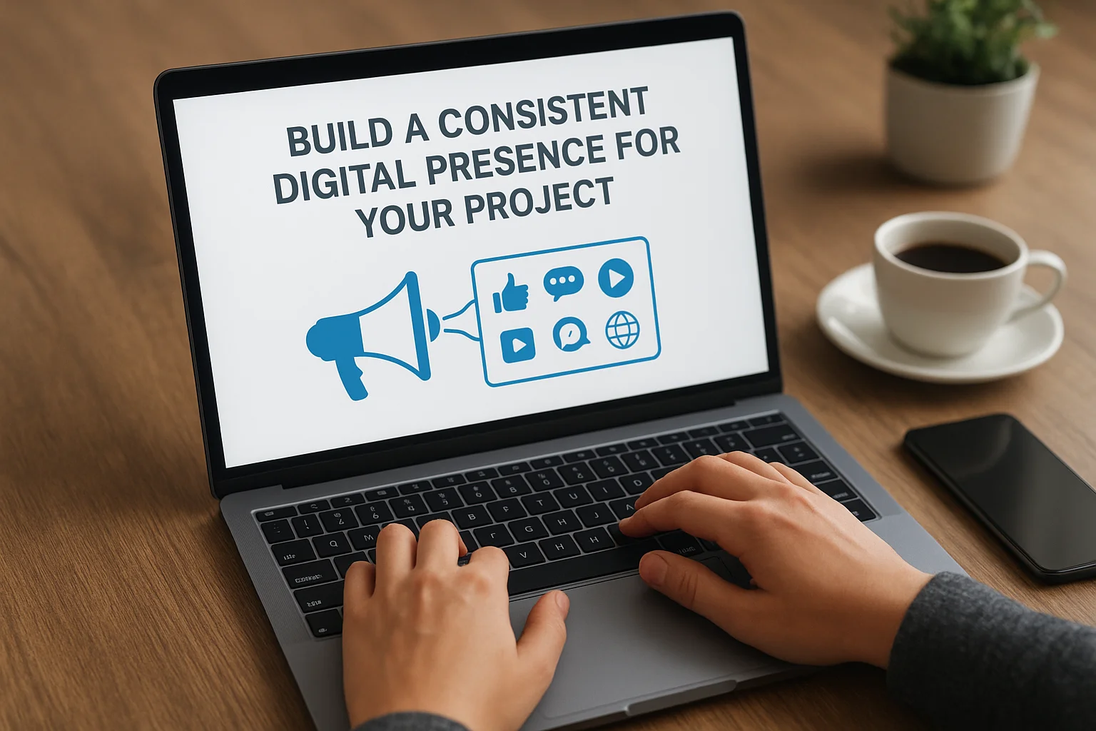
How to Build a Digital Presence for Your Project
A consistent digital presence is key to growing your project's audience and establishing trust. This article guides you through defining your brand, choosing platforms, crafting content, and engaging your audience effectively to create a cohesive and recognizable online identity.

Finding Your First Users Through Showcase Platforms
Launching a new product is exciting but challenging, especially when it comes to finding your first users. Showcase platforms offer startups a unique opportunity to present their product to a targeted audience eager to discover innovations. In this article, we explore how to leverage these platforms effectively to attract early adopters, gather feedback, and build momentum for your product’s success.

How to Present Your Project Online for Maximum Impact
In today’s digital world, presenting your project online effectively is crucial for success. Whether you're launching a startup, sharing creative work, or pitching an idea, the right presentation can make all the difference. This article explores key techniques to engage your audience, choose the best platforms, and use visuals and interactivity to maximize your project’s online impact.