
Mobile App Directory Listings: What Founders Get Wrong
 Add ShowMySites to preferred sources
Mobile apps get treated like tiny websites in directories. Founders paste an App Store link, drop a desktop-looking screenshot, pick a SaaS-ish category, and wonder why browsing users bounce. Apps are not web tools with a smaller screen. The listing has to prove install intent, device fit, and store trust in a few seconds.
This piece is about the mistakes that show up again and again when apps hit a website directory. It is not another category picker essay, though choosing the frame still matters. If you need that decision tree first, read how to pick the right ShowMySites category, then come back for app-specific traps.
Store links that confuse more than they convert
The first failure is the destination. Some listings send people to a marketing site that never mentions iOS or Android above the fold. Others link only one store when the product lives on both. A few bury the store buttons under a long story about the company vision.
Directory visitors who care about apps want a short path: understand the job, see a real device UI, tap toward install or a clear waitlist. If your primary URL cannot do that, fix the landing before you polish the listing copy.
Practical rules:
- Make the store path obvious within one scroll on mobile
- If you only ship on one platform, say so early so the wrong audience self-selects out
- Keep deep links working. Broken store URLs from a directory look like an abandoned project
- Do not hide pricing or in-app purchase reality if the store page already discloses it
Your listing description should match store positioning. If the store page sells "habit tracking for runners" and the directory blurb sells "all-in-one wellness OS," you create the same mismatch web founders create between listing and landing. Align nouns and outcomes.
If you are pre-store and collecting emails, say that plainly. A fake install path is worse than an honest waitlist. Directory users forgive early products. They do not forgive broken promises.
Screenshots that look like the wrong product
App listings often use website screenshots, Figma frames with giant margins, or tablet UI cropped so badly it looks like a dashboard SaaS. Browse-oriented users read visuals first. If the image does not scream phone or tablet experience, they assume web software.
Capture the real product on a real device frame only if the UI stays readable at thumbnail size. Prefer one primary job on screen, not a collage of five features. Avoid status bars full of personal notifications. Avoid light mode and dark mode mixes across a gallery that makes the app feel unfinished.
Also watch orientation. A landscape game screenshot next to a portrait productivity title confuses scanners. Match the category expectation. Utility apps usually win with a clean portrait task screen. Creative apps can show a richer canvas, but still need one readable focal point.
If you are still assembling assets while you create your website listing, ship a honest single-screen capture before a polished fake. Fake polish that collapses after install destroys trust faster than a simple true shot.
Refresh screenshots when the app UI changes. An old capture next to a newer store listing creates doubt. Treat visual sync as part of release hygiene, not a yearly cleanup chore.
Category traps that bury mobile apps
Directories built for websites push founders toward SaaS, Tool, or AI Tool because those labels feel familiar. Sometimes that is fair. A B2B mobile client that is really a companion to a web platform may belong with related software. Often it is a trap. Browsers filtering for web tools will click, bounce, and teach the system your listing is low quality.
Think about discovery intent. People browsing for apps want installable software, offline capability, camera access, notifications, or on-the-go workflows. People browsing SaaS want accounts, seats, and dashboards. If your app cannot deliver a web-first story, do not borrow a web-first label just because it sounds bigger.
When you are unsure, study how similar live products appear in the directory. Mirror the framing of apps that get engagement, not the framing of enterprise websites you admire. Category is a filter for human patience. Wrong filter, wrong audience, bad signals.
Also resist stuffing every possible tag in the description. "AI-powered SaaS marketplace tool app" helps nobody. Pick one primary job and one audience. Let the store pages carry the long feature list.
Copy mistakes that scream "this is a website pitch"
Web copy habits leak into app listings. "Start free trial," "invite your team," and "connect your stack" can be true and still feel wrong if the product is a single-player phone habit app. Use verbs people use on mobile: open, capture, track, notify, sync, continue on the go.
Mention platform requirements if they matter. Offline mode, tablet support, Wear OS, or iPad-only layouts change who should click. Leaving that out wastes clicks and frustrates users who install the wrong thing.
Keep the title human. App names that are clever brand coins often need a short descriptor. Directory grids punish mystery. A clear descriptor plus a strong screenshot beats a cryptic name plus a vague tagline.
For the writing craft shared with web listings, use the same discipline as a strong web blurb in the guide on how to write a ShowMySites listing that wins the click. The difference is proof: device reality, store path, and category honesty for mobile.
A quick pre-submit check for app founders
Before you hit submit, open the listing draft on your phone. Can you tell it is an app in two seconds? Is the next step install-shaped? Does the category attract people who want a mobile product? Would a stranger trust the screenshot as the real UI?
Ask one more question: would you install this after seeing only the directory card? If your honest answer is maybe, tighten the job statement and the visual. Directory traffic is impatient. Apps that look like websites get website expectations. Meet mobile intent on purpose, and the listing stops fighting the product you actually shipped.
Ready to showcase your project?
Join thousands of developers and entrepreneurs who have already listed their websites in our directory. Get discovered by potential users and grow your audience.
Free to list • Instant approval • No hidden fees
Frequently Asked Questions
What is the biggest mistake on mobile app directory listings?
Where should my listing send app visitors?
How should app screenshots differ from website screenshots?
Can I list a mobile app under SaaS or Tool?
Related articles
What Happens After You Submit: First 7 Days on a Directory
Most submission guides stop at the submit button. Here's what actually happens in the first 7 days after you submit your site to a directory - moderation, approval, indexation, and what to check.
 Michel Duar
Should You List Multiple Projects Under One Account?
Managing more than one project raises a practical question: one account or several? The answer depends on your situation, but the considerations are consistent across most directory platforms.
Michel Duar
Why Directory Leaderboards Still Drive Discovery Clicks
Directory leaderboards still drive discovery because people use ranked lists to shortlist projects fast. Learn why that human behavior creates clicks and how to earn them.
Michel Duar
How to Write a ShowMySites Listing That Wins the Click
A ShowMySites listing has a few seconds to win a cold click. Here is how to write titles, short descriptions, and field details that convert skimmers without sounding like slogan soup.
Michel Duar
Personal Website Listings That Don't Look Like Empty Portfolios
Most personal site listings read like blank portfolios. Learn how to write a human listing for the personal website category that makes people click, trust you, and remember what you do.
Michel Duar

Project Showcase Platforms: Where to Launch Your Web App in 2026
A comparison of the best project showcase platforms to launch your web app in 2026. Start with ShowMySites for a permanent DR68+ dofollow backlink, then stagger launches on Product Hunt, BetaList, Show HN, and niche communities. Learn how to time launches and what makes them land.
Michel Duar
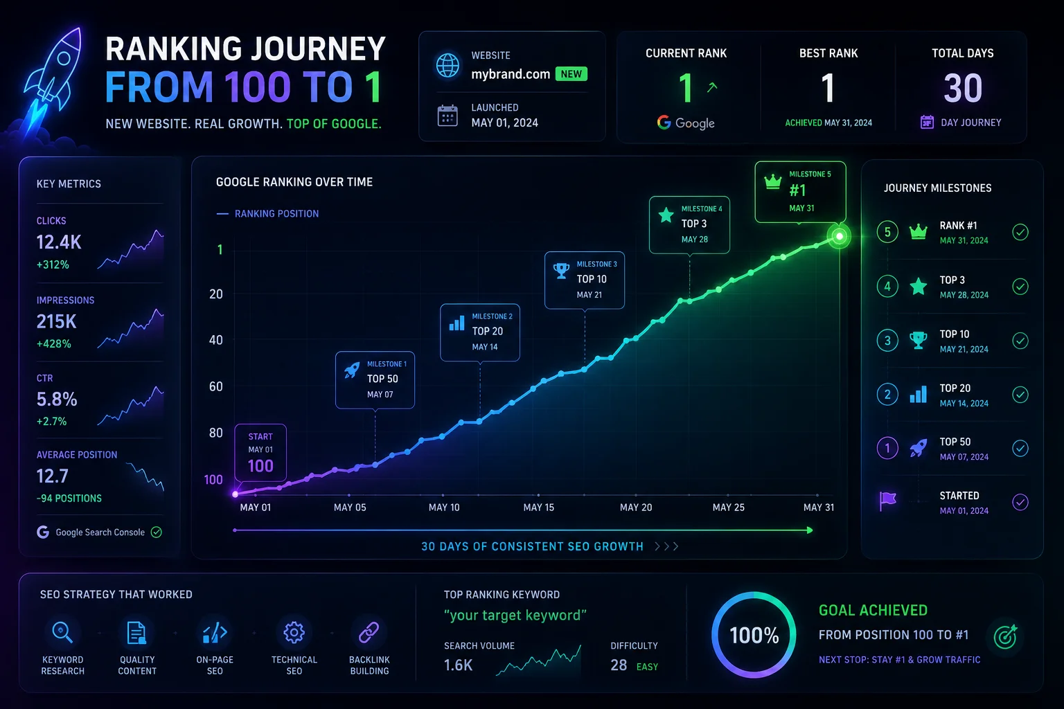
How to Rank a New Website on Google: Complete 2026 Guide
A step-by-step guide to ranking a new website on Google without existing authority. Start with ShowMySites for your first DR68+ backlink, then master keyword research, topic clusters, on-page SEO, technical setup, and free backlink building. Includes a 90-day roadmap for new domains.
Michel Duar

The Difference Between Niche Directories and General Directories for SEO
Understanding the difference between niche and general directories is essential for building an effective SEO strategy. This article explores how relevance, authority, traffic quality and strategic use cases impact the real value of directory backlinks in modern search optimization.
Michel Duar

Building a Feedback Culture to Improve Your Product Quickly
Learn how to create a culture where feedback flows freely from users and teams, enabling faster product improvements, better decisions, and continuous growth.
Michel Duar